Correcting for Scanner Imperfections
A scanner is basically a color copy machine hooked up to your computer. It bounces light off of a photo and receptors read the color information returned to the scanner. Most photos are covered with a reflective coating, which makes the photo look better to our eyes. The same coating that makes a photograph look better to you and me, makes the photograph harder to see for a scanner. The reflective coating bounces some light back to the scanner before the light hits any color information in the photo. What you end up with is a washed out image with a "film" over it.
Most every time you scan an image in, itll need color correction. Color photographs will always need color correction. PhotoShop does a good job of correcting for scanner deficiencies, and often it can do the whole job in just one step!
When you correct for scanning deficiencies, mostly youll adjust the PhotoShops Levels, which refer to color levels. Color Levels range from 100% white, to 100% black. Usually when there are scanning problems, there is too much white, but sometimes there are other problems caused by the scanner itself.
Letting PhotoShop Automatically Correct Images for You
This next web design course tool is going to blow you away.
1. Open boat.psd
2. Use the crop tool to straighten the scan

3. Click IMAGE-> LEVELS

The histogram represents color levels with black on the left and white on the right. See how much white there is? Images usually look better when the color levels are more balanced. Were going to let PhotoShop try to fix the image for us.
4. Click Auto

5. Try IMAGE-> LEVELS-> AUTO with temple.tif
Fine Tuning an Automatic Level
Sometimes when you use the "auto" button in the level window, the image will come out a little too dark or light. You can manually adjust the midpoint, the place where colors become more dark than light.
A midpoint value of 1.00 is perfect center. 1.10 will make the image a little lighter, 0.9 will make the image a little darker.
To adjust the midpoint:
1. Click IMAGE-> LEVELS-> AUTO
2. Change the setting in the top middle box in the Levels window

Use small adjustments!
Adjusting the Levels Yourself
Sometimes you will get better results futzing with the levels yourself. "Futz" is a PhotoShop technical term.
Usually you wont be able to tell if automatic or manual results will provide better results. Youll probably have to try them both.
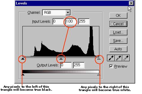
To manually adjust the levels, move the histogram triangles. You usually want to adjust the triangles so they line up with the bulk of the histogram. Dont adjust the middle triangle. Instead, use the input levels box like we did before.
Hiding Flashing Selection Lines
When you make a selection you get flashing lines that tell you where the selection is. Problem is, sometimes those selection lines get in the way. You can hide them by clicking:
VIEW-> HIDE EDGES or CTRL/CMD + H
**BE VERY SUPER-CAREFUL WHEN YOU HIDE EDGES. YOU MIGHT FORGET THAT THE SELECTION IS STILL THERE!
Color Corrections
Images of all types would look better if this was a little bit darker, that was a little bit lighter, and this was a little more blue. PhotoShop excels in changing color values to give you better-looking images. Remember that any of these tools can be applied to an entire image, or to a selection.
Most of the Color Correction tools are found under:
IMAGE-> ADJUST
Brightness and Contrast
Brightness is the amount of white found in an image. If you crank up the brightness, an image will become whiter. Sometimes dark hidden areas will reveal surprising detail!
Contrast is the difference between light and dark in the image. If you turn up the contrast light colors get lighter and dark colors get darker.
Using brightness and contrast, you can remove shadows or shiny forehead reflections. You can lighten teeth and balance images.
To use Brightness/Contrast:
IMAGE-> ADJUST-> BRIGHTNESS/CONTRAST


Try to make the dark part of the green boat tarp lighter.
Saturation
"Tone" means color, "saturation" means how much of that color.
Adjusting saturation will allow you to make changes that on the surface appear imperceptible, but that will really make a difference in your images psychological impact on your observer. When part of an image is slightly more saturated, it appears more full of life. You can saturate people or products to make them slightly stand out against their backgrounds. You can saturate eyes to give someone that special sparkle. Saturating can turn dull colors bright and vibrant.

The key to using saturation is "go easy". Dont over do it. A little goes a long way. Whatever other clich will make you treat the saturation tool with care.
To change saturation levels:
No comments:
Post a Comment